Fluid feedback
A one-tap rating card for Fluid, Pickyourtrail’s corporate travel platform. It asks how booking went, then how the trip went, on web and in the app.
Concept
- Claude Code
Why I built it
Fluid needed a light way to hear from travellers, about booking and about the trip itself. Travellers are mostly in the app and admins mostly on web, so one small card had to work in both, with no second screen.
- 2questions: the booking, then the trip
- 11layouts tried for the wide web card
- 1gesture to rate on mobile: drag
What I did
A track scale, not decoration.
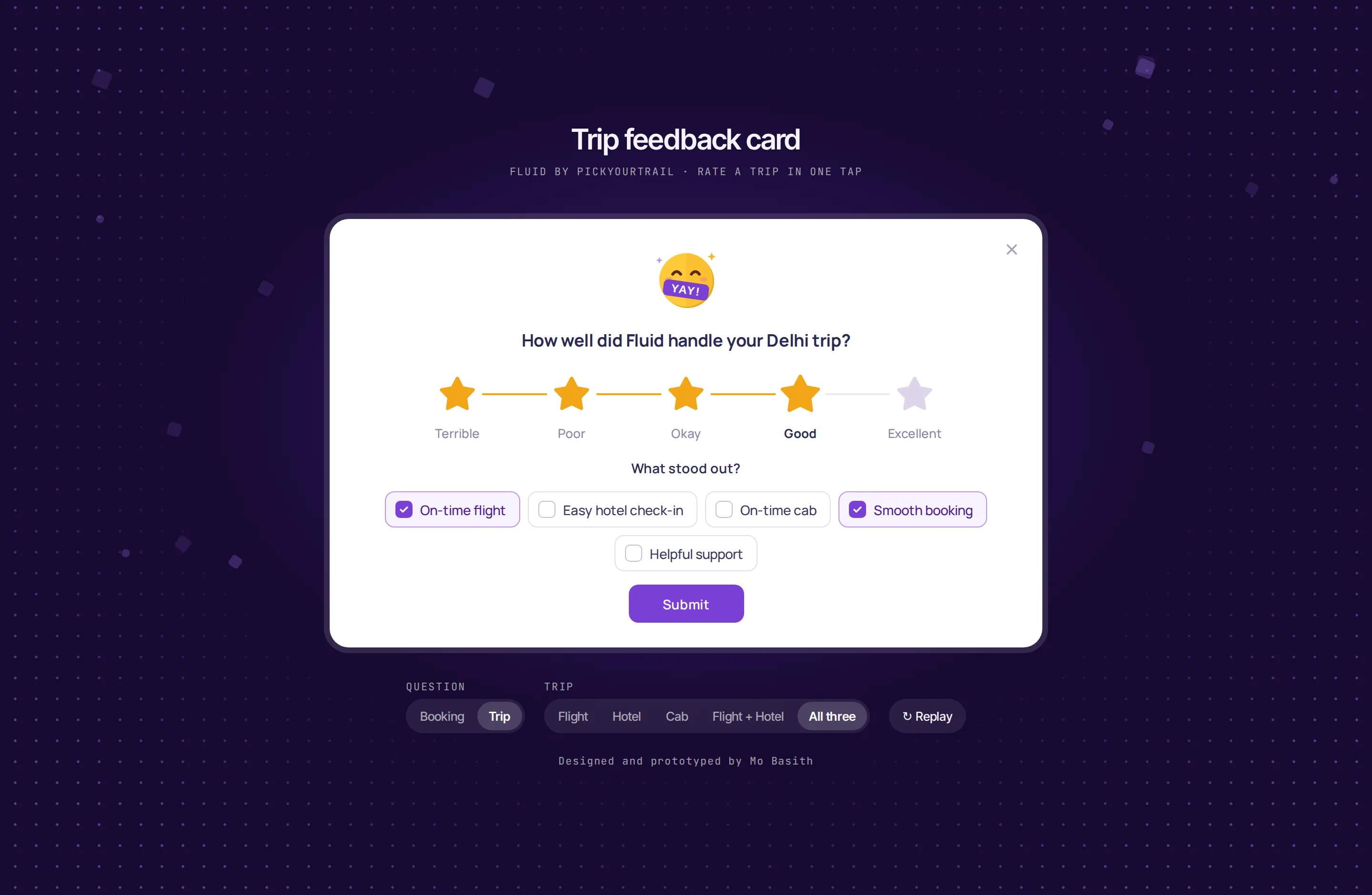
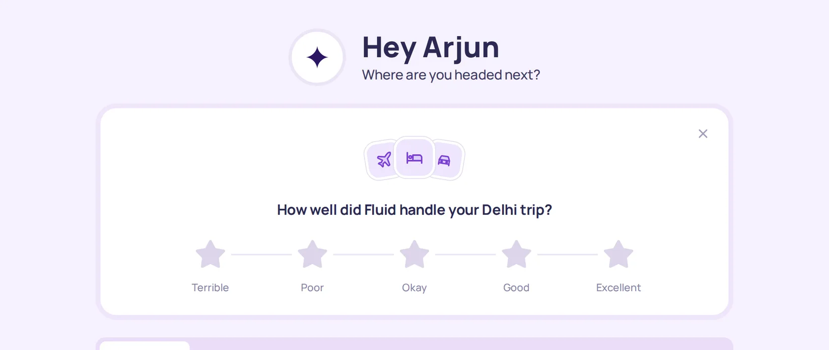
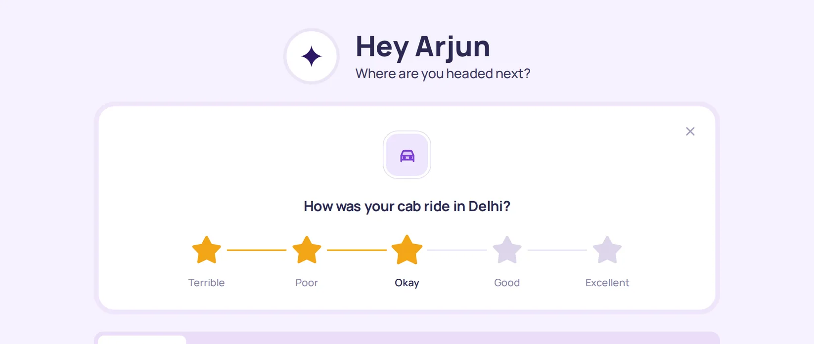
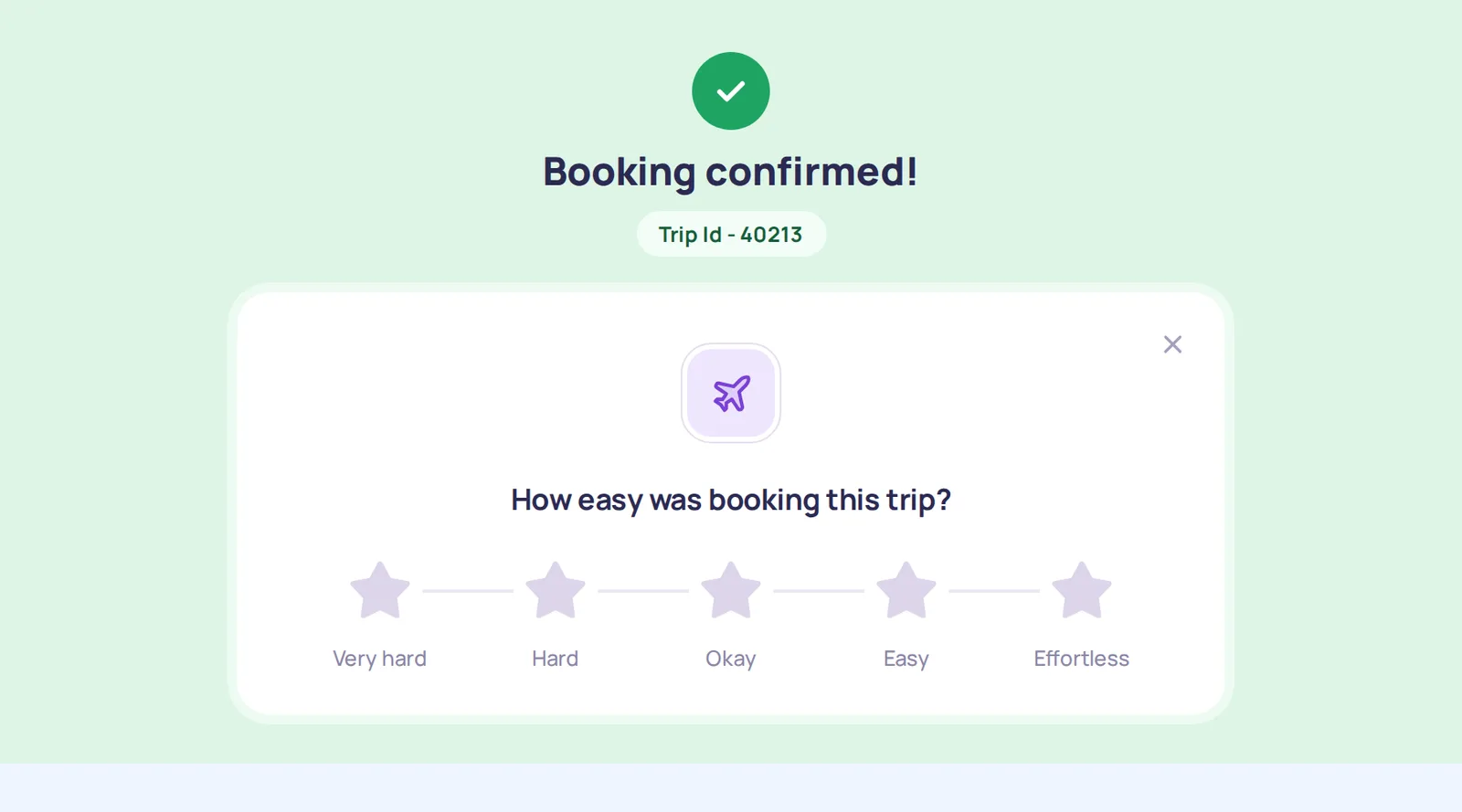
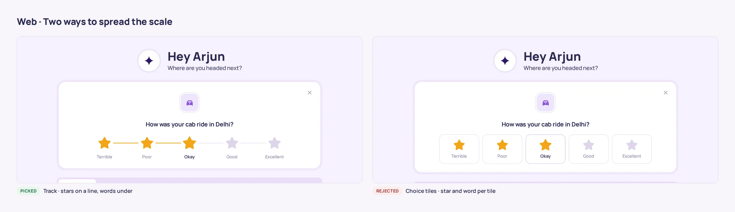
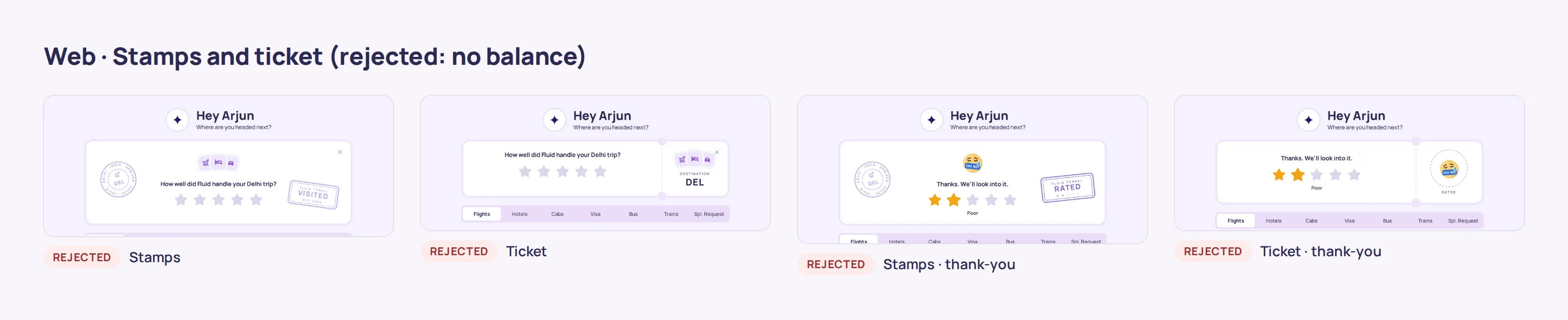
The wide web card had dead space around five stars. I tried eleven layouts, from ripples and orbits to stamps and a ticket. Decoration didn’t balance; a scale with a word under each star filled the width with something useful.
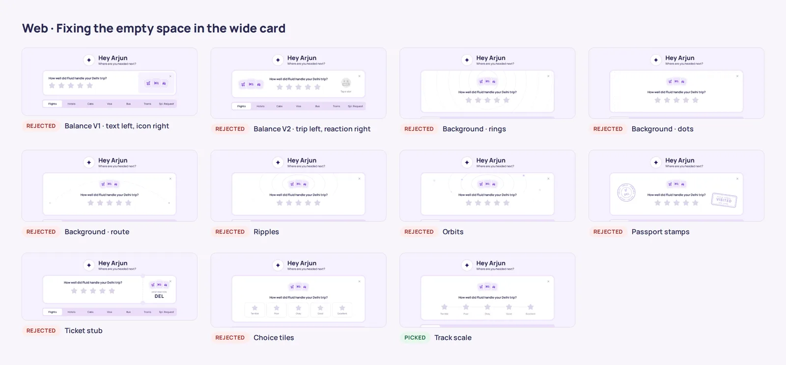
Fixing the empty space: ten rejected layouts and the track scale Reaction, then a short follow-up.
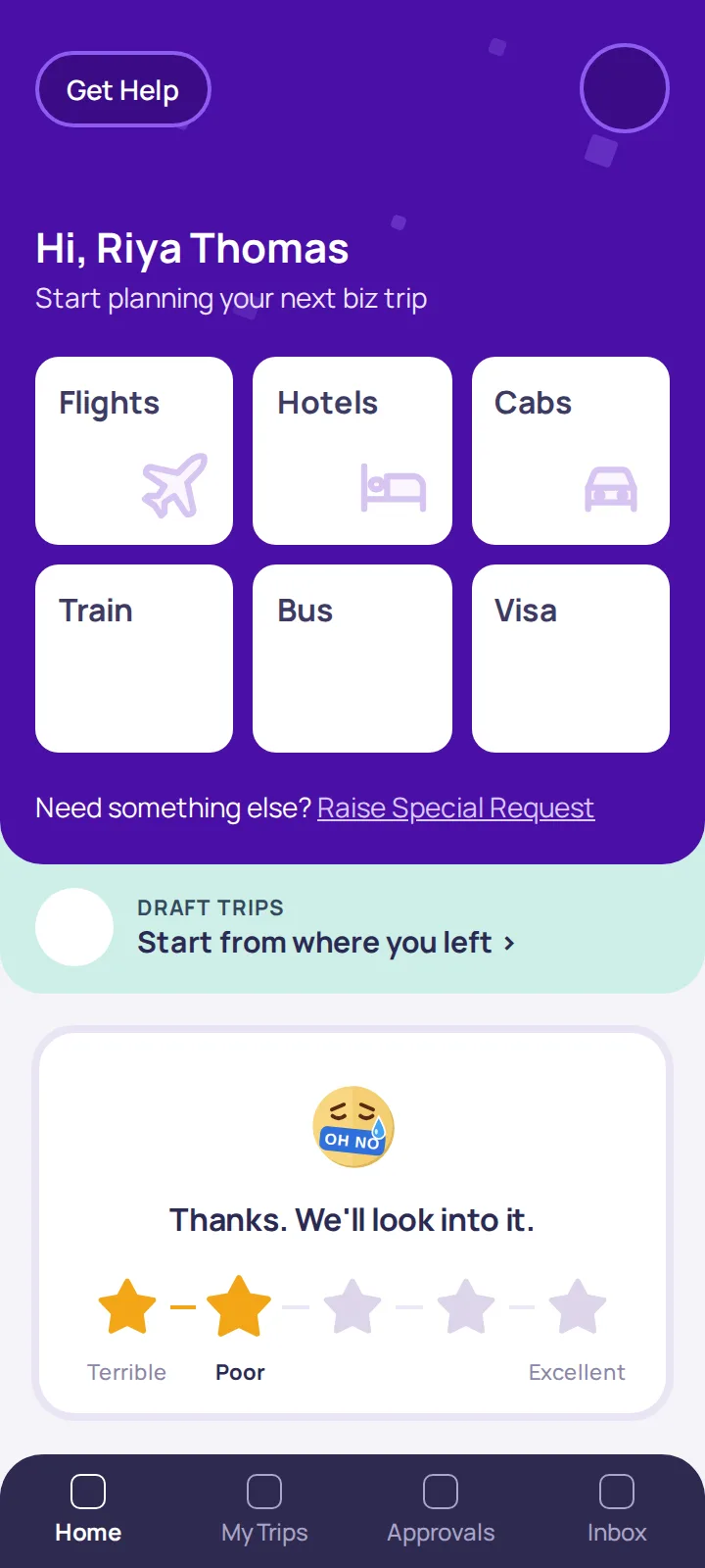
A rating swaps the trip icons for a reaction, then “What stood out?” pills and an optional note follow on the same card. No second screen.
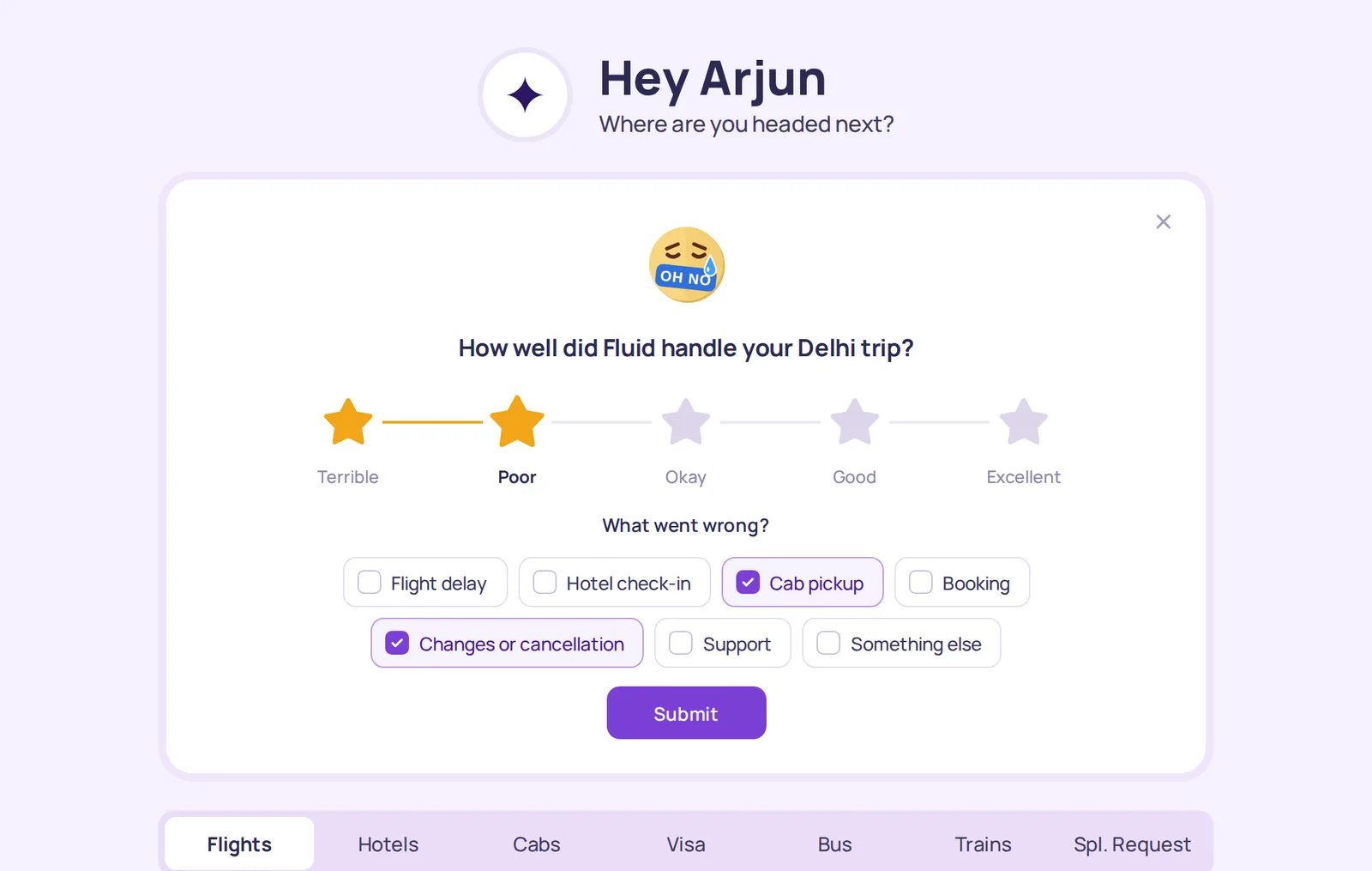
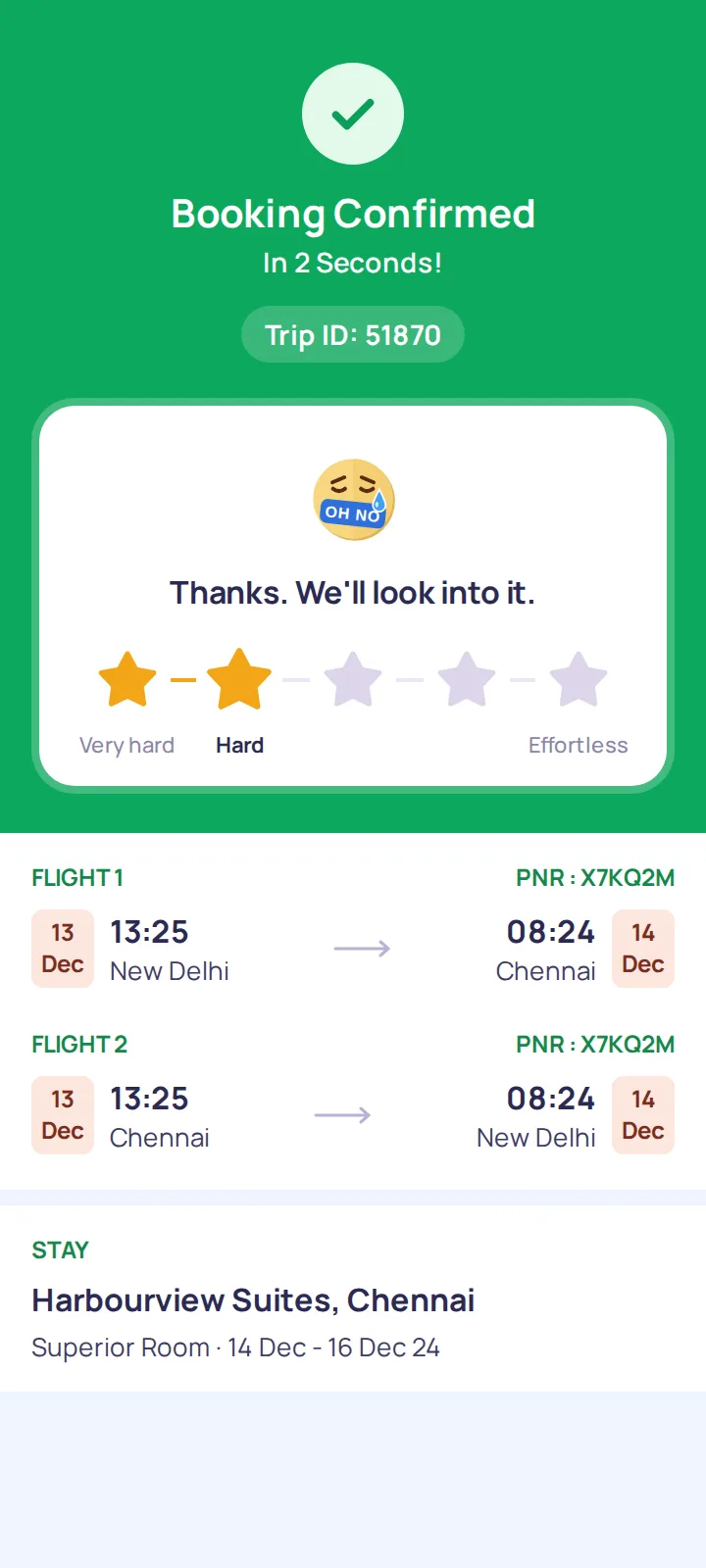
After a low rating: a reaction, “What went wrong?” and submit One gesture on mobile.
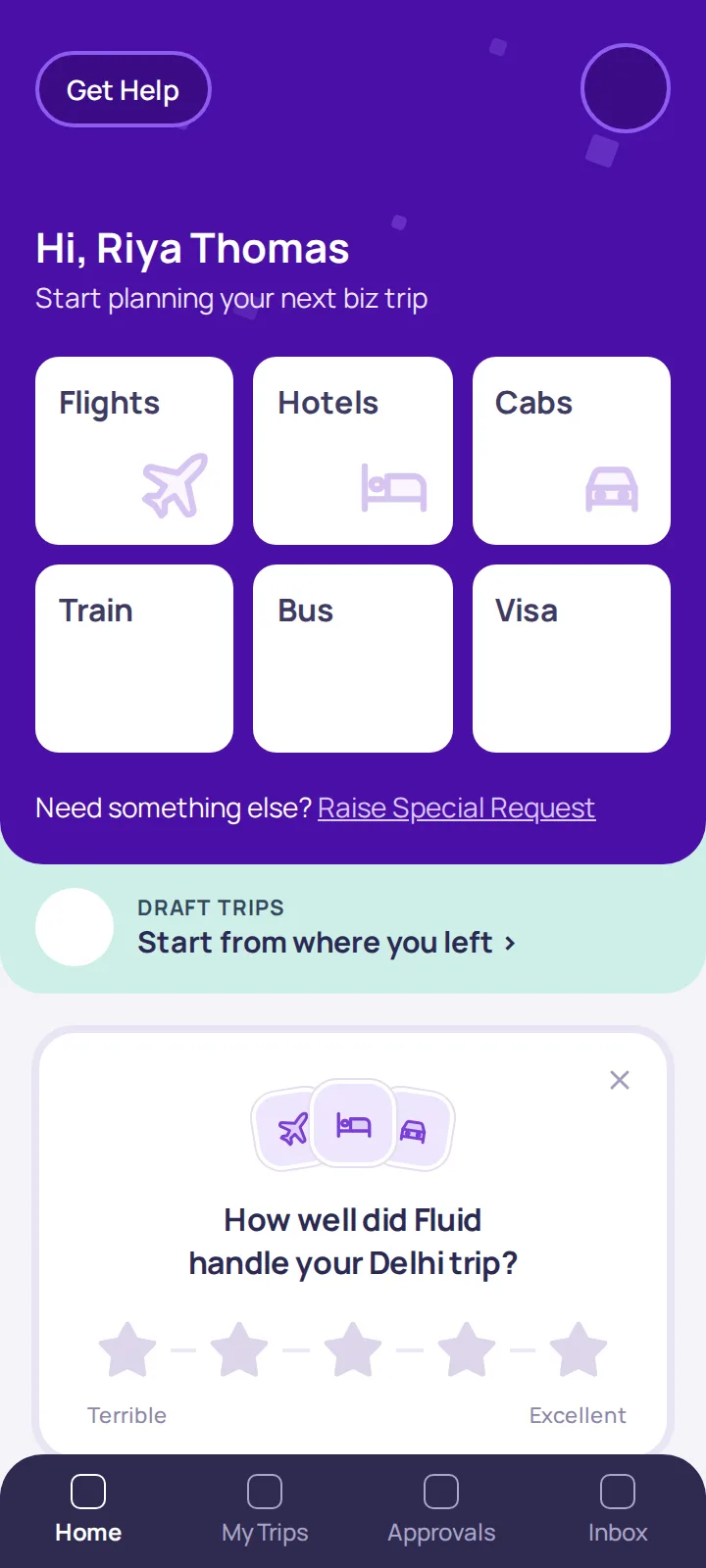
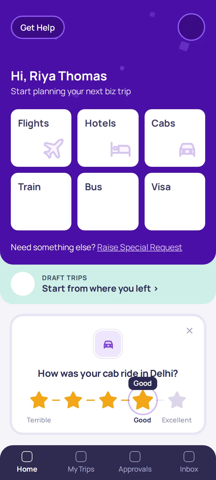
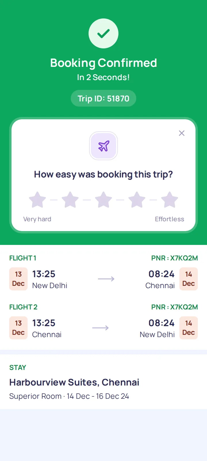
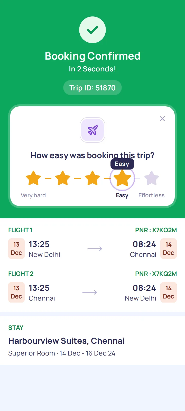
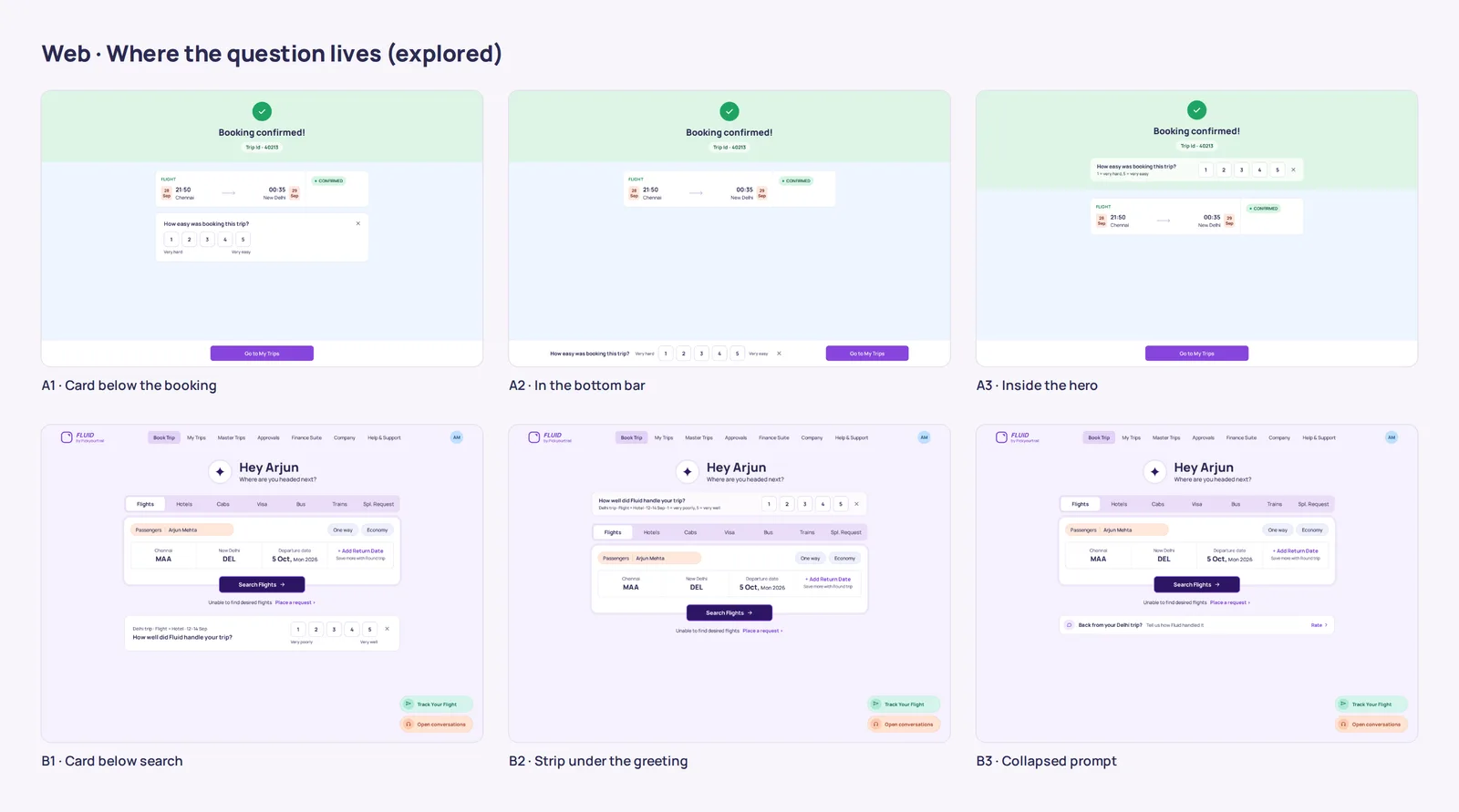
The question sits centred under the icon, and rating is drag only, with a word bubble while you drag. The card sits right below the hero; a docked bar-and-sheet version was built, then dropped.
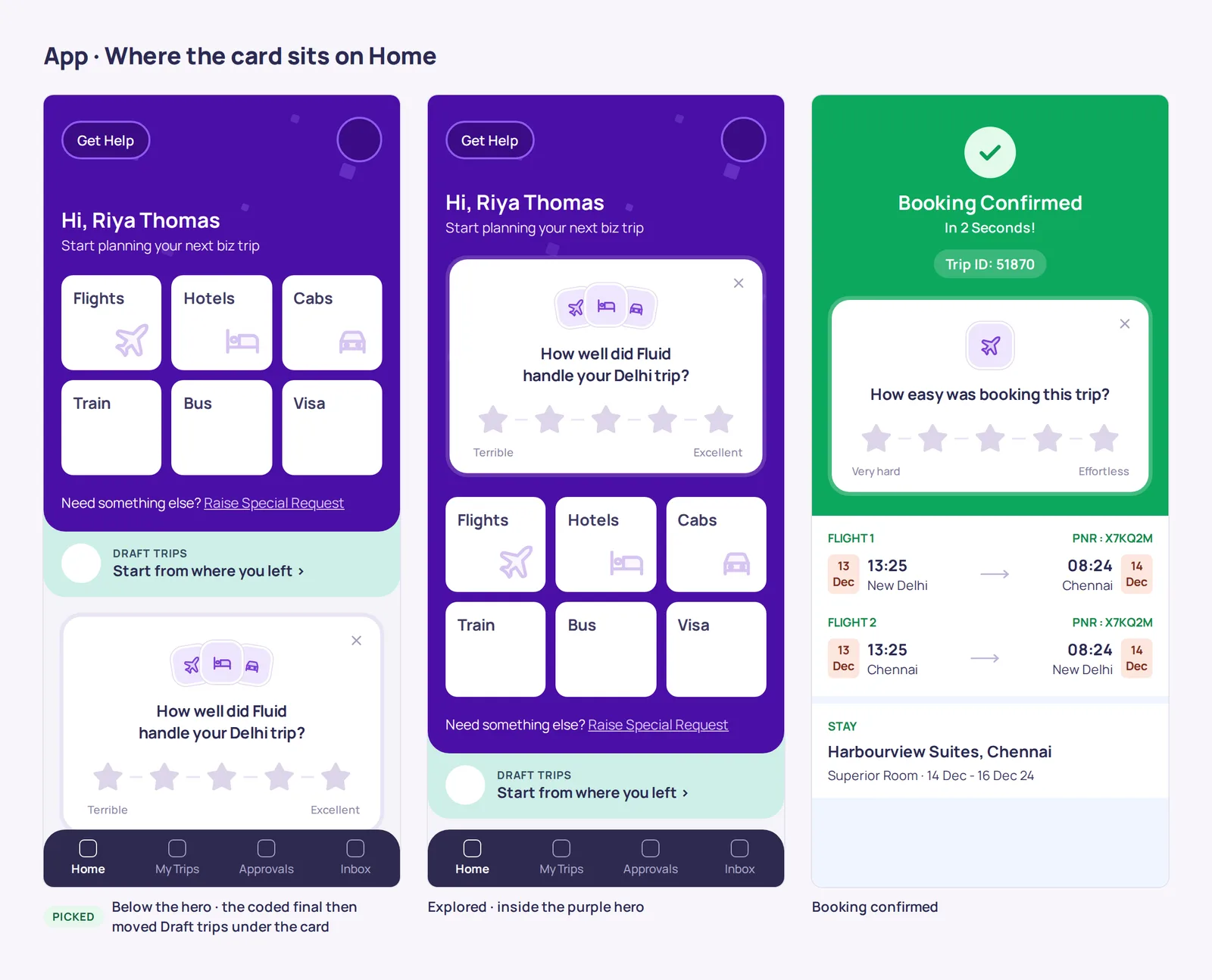
Where the card lives in the app, explored
More screens
Drag or scroll to browseSwipe to browse